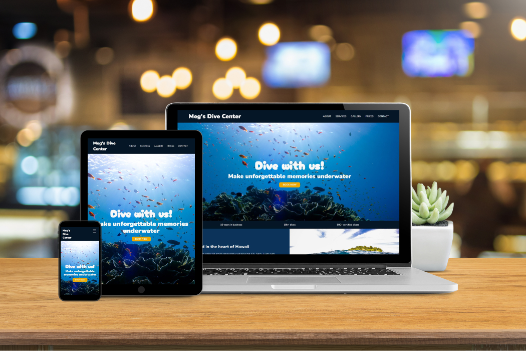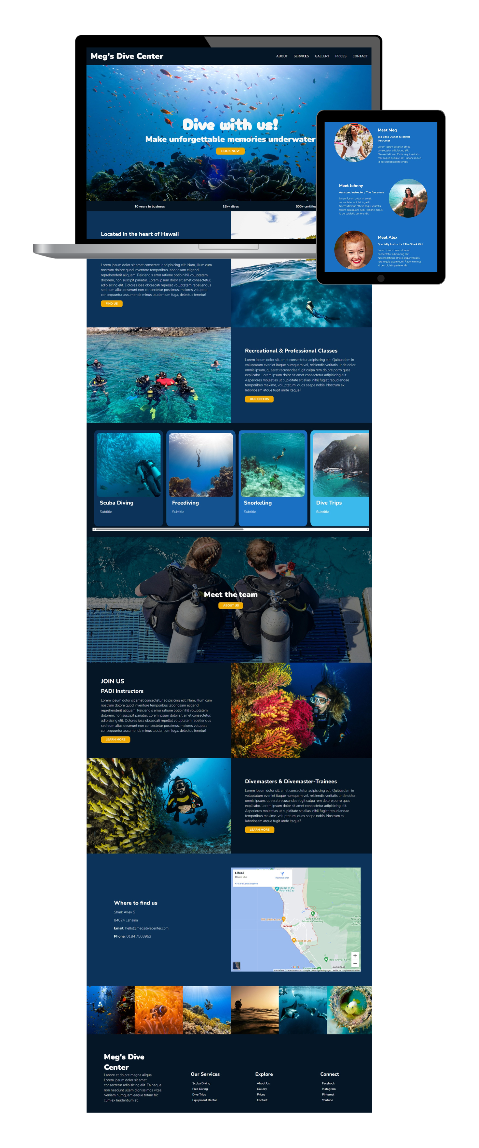
The plan for this case study was to create a vibrant, multi-page dive center website that would pull its visitors into a colorful underwater world and turn them into students.

This website has one main purpose: To inform about the dive center's offers and get people to sign up for them. Through a clear structure and well-placed navigation links users intuitively find all information they need. Strategic placements of CTAs, contact information, an interactive map and a contact form invite potential students to contact or visit the dive school.
In addition, an abundance of beautiful photos on every page and a stunning popup gallery encourage visitors to dive deep into daydreams about their next underwater experience.
The heart piece of this website is the services page. Here offers for every skill level are displayed in well-designed sections leading from beginner to pro. All courses are collected in an array of clickable cards which open modals that provide more information about each offer.
Different shades of blue resembling the ocean's colors in various depths used to display offers for different skill levels.
Rounded fonts and elements for a bubbly touch.
Cards and popup-modals informing in-depth about various offers.