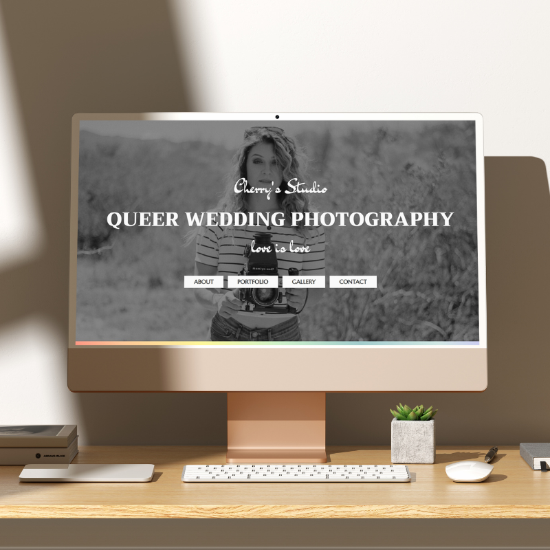
This case study shows a simple and elegant website for a queer wedding photography studio. Pastel colors create a soft rainbow effect that stands out from the white and grey tones of this site. Serif and handwriting fonts, as well as black and white photos on the homepage establish a classy look, while the gallery and portfolio pages showcase the photographer's work in color.
This site is responsive, can easily be edited in the CMS and utilizes interactive elements to guide visitors through the content, encouraging them to take the desired action.
Visit live site
The CMS makes editing the site simple: sections can be shown or hidden with one click, contents and image aspect ratios can be changed quickly.
Handpicked icons complementing the content and theme of the site.
Animations add some movement, rainbow hover effects on buttons & links provide feedback to make the site easy to navigate.
Contact information and a simple contact form encourage site visitors to get in touch.
A cute portfolio section links to the galleries of featured wedding projects.
A customized map matches the style of the page, even including a rainbow-colored heart to pinpoint the studio's location.